Notion dashboards make or break your team’s setup. Every good system needs them, but most teams either skip them entirely or build cluttered mega-pages that nobody wants to open. In this guide, you’ll learn the complete framework we use with consulting clients: where dashboards fit in your workspace architecture, what should go on them, and how to build the three dashboard archetypes step by step — including Notion’s new tabs and dashboard view features.
Why Do Notion Dashboards Matter? Front End Vs. Back End
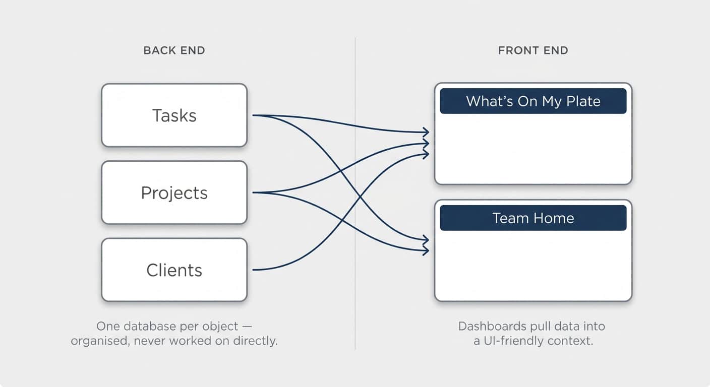
Dashboards are the front end of your Notion workspace — the pages where your team actually works. Your data lives in the back end: one central database per object (tasks, projects, clients), neatly organised but never worked on directly.
Separating the two is the first big differentiator between a workspace that just about chugs along and one that does serious heavy lifting. It’s a concept borrowed from software engineering, and it’s surprisingly intuitive: the back end is where you organise information, the front end is where you work with it.
Working directly from a central database creates two problems:
- You only ever see one object at a time. You can’t look at your deals with additional context on the side — it’s just the table.
- It doesn’t scale. You quickly end up with a dozen views bolted onto one database for different people and situations. Cluttered, confusing, and the main reason teams feel Notion “doesn’t scale”.
Instead, your team should work from dashboards that pull the relevant data into a UI-friendly context. A “My Tasks” page built from linked views. A team home page showing recent deals and active projects side by side. Suddenly Notion feels like a proper app rather than a spreadsheet tool.
This is also the only way to build something like a “What’s On My Plate” page — a single spot where anyone in your organisation sees every task, deal, and project assigned to them. No checking a dozen different inboxes.
Pro Tip: If people on your team open a central database to do their work, that’s your signal to build a dashboard. Databases organise data — dashboards are where work happens.
What’s The Difference Between Record And Hub Dashboards?
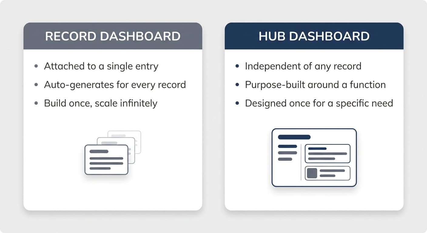
A record dashboard is attached to a single database entry — every project, deal, or client gets the same layout automatically. A hub dashboard is independent of any record and built around a function: a team home page, a “What’s On My Plate” view, a sales pipeline overview.
The distinction matters because of how they’re set up:
- Record dashboards auto-generate. Create a third project, click into it, and its dashboard already exists — showing related tasks, meetings, and docs. Build once, scale infinitely.
- Hub dashboards are purpose-built. You design your home page once. You have one “What’s On My Plate” page, one page per team. They exist to solve for something specific.
As a rule of thumb: pretty much every database that pulls from other sources should have a record dashboard. Hub dashboards get built when a specific need appears — like giving the sales team one place to see their pipeline.
How Do You Create A Consistent Visual Design Language?
A consistent visual design language means the same patterns repeat across your entire workspace, so even occasional users instantly recognise what they’re looking at. You can build the most amazing dashboards — without consistency, they’ll still confuse anyone who doesn’t live in the setup daily. Three small habits compound massively over time:
1. Pick One Icon Per Concept
Choose one main icon per database and stay within one icon family — if you use the minimal icons, stick with them throughout. Then go further:
- Never leave properties on their default icons. Pick a dedicated icon per property and use the same one across every database — if “Owner” is a circle on deals, it’s a circle on tasks too.
- Relations always get the main icon of the database they point to. If companies are represented by a factory, every relation pointing to companies shows the factory.
- Apply entry icons via a default template so every new record carries its icon automatically. For existing entries, select them all, right-click, and hit Edit icon.
The payoff: when you @-mention a company on any page, the icon travels with it — everyone immediately knows what type of thing you’re referring to, even without context.
2. Keep The Same Property Order Everywhere
If your tasks show status, name, owner, due date — show them in that order on every view, on every dashboard. You don’t always need the same number of properties (a “Done” view might swap the due date for a completion date), but the visible ones should follow a recognisable pattern.
3. Pick One Dashboard Archetype And Stick With It
At least while rolling out your system, use one of the three layout archetypes (covered below) across all your dashboards. It’s the same principle app designers follow: when interfaces feel familiar across the system, users reorient themselves instantly.
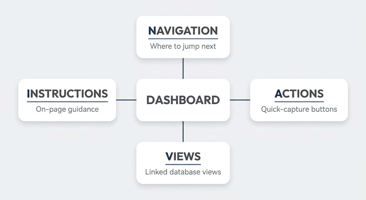
What Goes On A Dashboard? The NAVI Framework
Every Notion dashboard is assembled from four components — Navigation, Actions, Views, and Instructions. NAVI is your mental checklist: you won’t always need all four, but you should consciously decide on each one.
- Navigation — Pages don’t exist in isolation. Ask: when I’m on this dashboard, where would I logically jump next? At minimum, add a button back to the main page — and set it to open as a full page, not a pop-up.
- Actions — What should be easy to do right here? Quick-capture buttons for adding a task, creating a record, and so on.
- Views — The core of most dashboards: linked database views pulling from your back end. This is what takes up most of the screen real estate.
- Instructions — Tips and explanations written directly onto the page. One of Notion’s underrated strengths, especially when building for colleagues who don’t interact with the setup every day.
How Do You Decide What A Dashboard Should Show?
Define the dashboard’s job before designing anything. Borrowing from the jobs-to-be-done framework, every dashboard should complete this statement:
When [situation], I open this dashboard to see [information], so I can [outcome].
A few examples:
- “When I start work in the morning, I open What’s On My Plate to see everything I’m responsible for, so I can decide what to work on next.” — orientation and prioritisation.
- “When the sales team meets for the weekly all-hands, we open this dashboard to review pipeline metrics, so we can agree on next steps.” — meeting-driven.
For record dashboards, the job is usually obvious: show everything connected to this record, so you can jump to related information. For hub dashboards, the world is your oyster — which makes them harder to design. Start with the simple wins: individual overview pages, team dashboards, then meeting-driven dashboards.
You can also let AI work this out with you. Paste this prompt into Notion AI and let it interview you:
You are an experienced Notion consultant helping me design a dashboard.

Interview me one question at a time. Ask about:
1. Who this dashboard is for (individual, team, or role)
2. The specific situation in which they'll open it
3. What they need to see in that moment
4. What they need to be able to do from there
5. What decision or outcome the dashboard should enable
6. Where they'd want to navigate to next

After the interview, summarise the dashboard's job in this format:
"When [situation], I open this dashboard to see [information],
so I can [outcome]."

Then propose the dashboard contents using the NAVI framework:
- Navigation: links or buttons to related pages
- Actions: quick-capture buttons or shortcuts
- Views: the specific database views, including filters and sorts
- Instructions: any on-page guidance for users

Keep the dashboard as lean as possible — challenge me if I try to
add elements that don't serve the core job.
Pro Tip: Design more small dashboards rather than a few big ones. Mega-dashboards force people to scroll through noise to find what they need — which defeats the entire purpose of moving away from central databases in the first place.
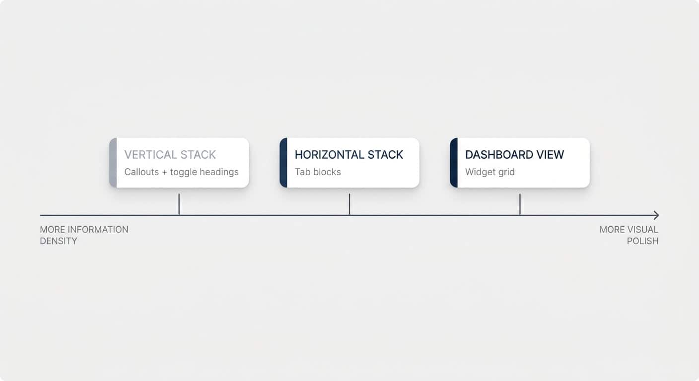
What Are The Three Notion Dashboard Archetypes?
There are three dashboard layouts to choose from: the vertical stack, the horizontal stack, and the dashboard view. They sit on a scale — the vertical stack offers the most information density, the dashboard view the most visual polish.
One thing before the design talk: a fully thought-through dashboard with a clear job will always outperform one that looks amazing but doesn’t have one. Plenty of pretty screenshots online are exactly that — pretty, not functional. Get the job right first, then pick your layout:
| Archetype | Built With | Information Density | Visual Polish | Best For | Main Limitation |
|---|---|---|---|---|---|
| Vertical Stack | Callouts + toggle headings + linked views | High — multiple sections open at once | Moderate | Information-dense personal or team overviews | Less polished look; pages get long |
| Horizontal Stack | Tab blocks + linked views | Medium — one tab visible at a time | High | Clean overviews with clearly separated sections | Only one tab’s content visible at once |
| Dashboard View | Notion’s dashboard view with widgets | Lower — fixed widget heights | Highest — app-like grid design | Polished at-a-glance pages, charts and metrics | One view per widget; max 4 widgets per row, 12 total |
How Do You Build A Vertical Stack Dashboard?
The vertical stack combines three components: callouts, toggle headings, and linked database views.
- Type
/callout, click the icon to remove it, then set the colour to Default background via the six dots. You get a clean outlined box — just like containers in web design. - Inside the callout, add a Toggle heading 2 and name it after the section (e.g. “Tasks”).
- Inside the toggle, type
/linked view of databaseand pick the database from your back end.
Then run through view setup 101 — the four decisions for every view you ever create:
- Property visibility — decide which properties show, and in which order. Same order everywhere, remember.
- Name and icon — rename the view (e.g. “Open”) and give it a consistent icon, like an unchecked box for open tasks.
- Filter — e.g. owner contains Me, and status is not complete. “Me” is dynamic: build the dashboard once and it filters for whoever is looking at it. Hard-coding a person only makes sense for team- or role-specific dashboards.
- Sort — e.g. earliest due date at the top.
Optionally, add grouping or conditional colours — highlighting high-priority rows, for example — but only if it serves the dashboard’s job. From there, duplicate the callout for projects, meetings, docs, and whatever else belongs on the page, then add navigation and action buttons on top.
Pro Tip: Keep table views in a single column — they need the width, especially on a standard laptop screen. Minimal layouts like lists work nicely side by side in two columns. And the moment a page contains database views, switch it to Full width via the three-dot menu.
How Do You Build A Horizontal Stack Dashboard With Tabs?
Tabs are a recent Notion addition that make this archetype possible. Type /tabs and Notion creates a callout-style container with horizontal tabs — each tab behaves like its own mini page, with every block type available inside.
Name your tabs (Tasks, Projects, Meetings), then drop the relevant linked database views into each one. The result is a very clean look: lots of information on the page, but only one slice visible at a time.
That’s also the trade-off versus the vertical stack: toggles let you have tasks and meetings open simultaneously; tabs only ever show one section. Cleaner look, less parallel context — pick based on the job.
Pro Tip: Set up “master views” on your back-end databases — a default table and a default board with your standard properties, filters, and sorts. Every linked view you create anywhere in the workspace can start from one of those views with a single click, getting you 50–80% of the way there and keeping your visual design language consistent without manual rebuilding.
How Do You Build A Dashboard View?
The dashboard view is Notion’s pre-built grid layout — confusingly named, since all of these pages are dashboards, but it’s the most app-like option of the three. Type /dashboard (or add a Dashboard view to any database) and you can slot individual database views into a grid of widgets.
Use Edit mode to add widgets, rearrange them, and adjust their height and width; use View mode for day-to-day work. A few things that set it apart:
- The most polished look — subtle background shading, floating badges, and consistent containers you can’t replicate with regular blocks.
- Fixed widget heights — longer lists scroll inside their widget instead of stretching the page.
- Capacity limits — up to 4 widgets per row and 12 widgets in total.
The catch: each widget holds exactly one database view. There’s no stacking “open tasks / done tasks / due today” inside a single widget — every cut of your data needs its own spot on the page. If you need to slice and dice information in many ways, you’ll hit mega-dashboard territory quickly. But if your needs are simple — here’s what I’m working on, here’s what’s done — it’s an incredibly clean way to present it.
💼 Need the support of certified Notion Consultants? My team and I are here to help!
Should You Use Templates Or Layouts For Record Dashboards?
Record dashboards can be built two ways: as database templates or as database layouts. Templates control page content and apply at creation time; layouts control how every page in the database looks and apply to all entries instantly. Most serious setups use both.
Building Record Dashboards With Templates
A template defines page content that gets stamped onto new entries. Build your dashboard inside the template — tabs, callouts, views, whatever you need — then set it as the default via the three dots next to the template name. Every new record now arrives with its dashboard ready.
The key trick: when adding a linked view inside a template, set an advanced filter like Fund contains [template name] — selecting the template itself, which sits at the top of the list. Click Save for everyone, and Notion auto-updates that filter for every new entry. Each record’s dashboard filters itself to its own related items, with zero manual setup.
The drawback: templates apply at creation time only. Change the template later, and existing entries keep the old version. You can reapply the template to refresh a page — but any text written directly on that page is lost in the process, so handle with care.
Building Record Dashboards With Layouts
A layout controls the look of every page in a database — and changes apply to all entries the moment you hit save, existing ones included. Hover over any entry and click Customize layout to design it.
Two quick wins for basically every database:
- Move the property group to the side panel, so a long property list stops eating your screen.
- Pin the properties you always want visible at the top — Notion now supports up to 15 pinned properties, up from the previous four.
For dashboards specifically, switch the layout structure from Simple to Tabbed. Each layout tab holds exactly one database view of a related database — no text, no buttons, just the view. That covers the V in NAVI beautifully, but navigation, actions, and instructions still need to live in a template if you want them.
Pro Tip: To stack multiple views inside a single layout tab, set that tab’s view type to Dashboard. That way “My Open Tasks”, “All Tasks”, and “Completed” can live in one tab instead of cluttering your page header with three separate pills.
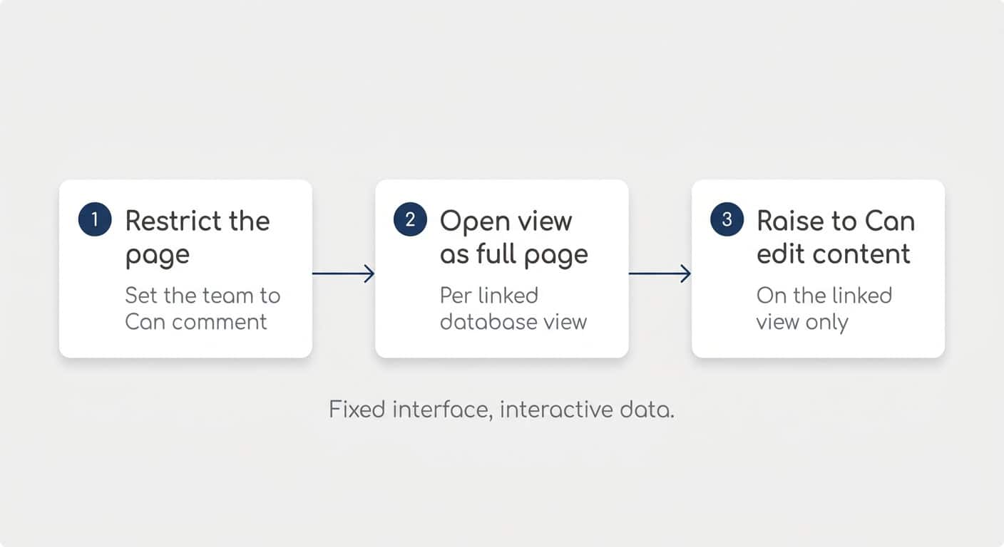
How Do You Protect Your Dashboards From Accidental Edits?
Locking a page isn’t enough. Anyone with edit access can unlock it, and a locked page also stops people from updating entries directly on the dashboard — no checking off tasks, no dragging cards. The proper protection is a three-step permission setup:
- Restrict the dashboard page. In the Share settings, drop everyone except your admin group down to Can comment (or Can view). Can comment is handy — people can still suggest improvements.
- Open each linked database view as a full page. Click the six dots on the view and choose Open as full page. This is important: the next setting lives on the linked view on your dashboard, not on the original database.
- Raise the team group to “Can edit content” on that linked view’s share settings.
The result: your team can check off tasks, drag cards across a Kanban board, and update properties — but nobody can move blocks, change view configurations, add properties, or restructure the page. The dashboard behaves like a proper app: interactive data, fixed interface.
You’ll need to repeat steps 2–3 once per linked database on the page (views from the same source are covered together). A little effort once — and then nobody can mess with your precious dashboards.
How Does AI Change Notion Dashboard Design?
AI shrinks the “Actions” part of NAVI dramatically. When you can simply tell Notion AI “add a task for tomorrow”, you don’t need capture buttons cluttering your UI anymore — honestly, manually entering tasks is quickly becoming a thing of the past.
That pushes dashboard design towards cleaner, leaner pages: show the most important information, and let chat handle the slicing and dicing. “Which of these are due today?” is one question away — you don’t need a dedicated filtered view for every variation.
It also makes the polished, lower-density dashboard view more attractive than it would have been a year ago: less UI to maintain, with AI filling the flexibility gap.
And of course, AI can build dashboards for you. Once you understand the building blocks in this guide, you can turn them into instructions — “use tabs, keep properties in this order, filter by Me” — and let AI assemble the page. Knowing the manual way is exactly what makes the AI way work.
Frequently Asked Questions
What Is The Difference Between A Dashboard And A Database In Notion?
A database stores and organises your data — it’s the back end. A dashboard is a regular Notion page that pulls linked views from one or more databases into a context where people actually work — it’s the front end. Your team should work from dashboards, not from central databases.
Can One Dashboard Work For Every Person On The Team?
Yes — use the dynamic Me filter on your database views. It automatically filters to whoever is viewing the page, so a single “What’s On My Plate” dashboard shows each team member exactly their own tasks, projects, and deals. Build it once, and the whole organisation can use it.
Should You Lock Notion Dashboards?
Locking only prevents accidental edits — anyone with edit access can unlock the page, and locking also blocks quick interactions like checking off tasks. Instead, set the dashboard page to “Can comment” for your team and raise each linked database view to “Can edit content”. That keeps the layout fixed while the data stays fully interactive.
How Many Widgets Fit In A Notion Dashboard View?
A dashboard view supports up to 4 widgets per row and 12 widgets in total. Each widget displays exactly one database view, and you can adjust widget heights and widths in Edit mode.
Should You Use A Template Or A Layout For Record Dashboards?
Use layouts for structure that should update across all entries instantly — pinned properties and tabs with related database views. Use templates for actual page content: text, instructions, buttons, and freely arranged views. Templates only apply at creation time, so layout-based elements are easier to maintain long-term.
💡 Looking for more tips? Join 39k Notion Fans on our bi-weekly newsletter and get access to 41+ free resources